Case Study · Data Visualization · Campaign
An illustrated interactive map microsite for a holiday campaign — built and shipped during the first pandemic holiday season. Warm, place-rooted, handcrafted. The most visually distinct work in this portfolio.
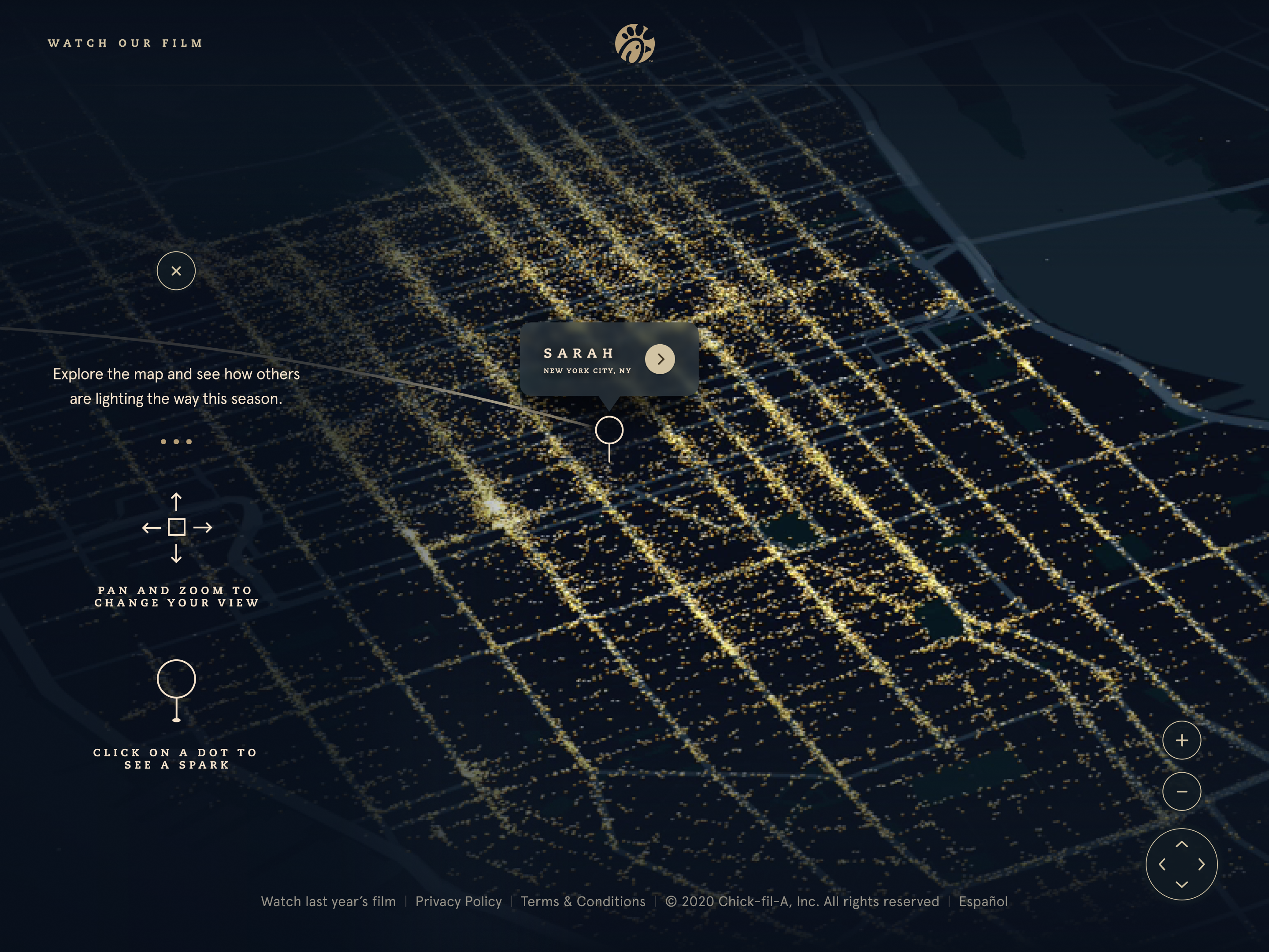
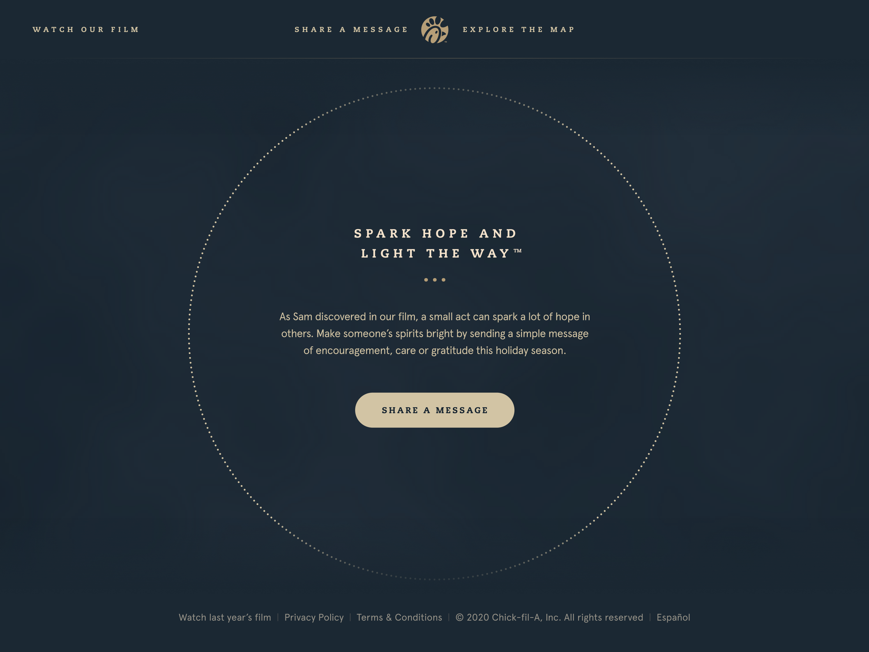
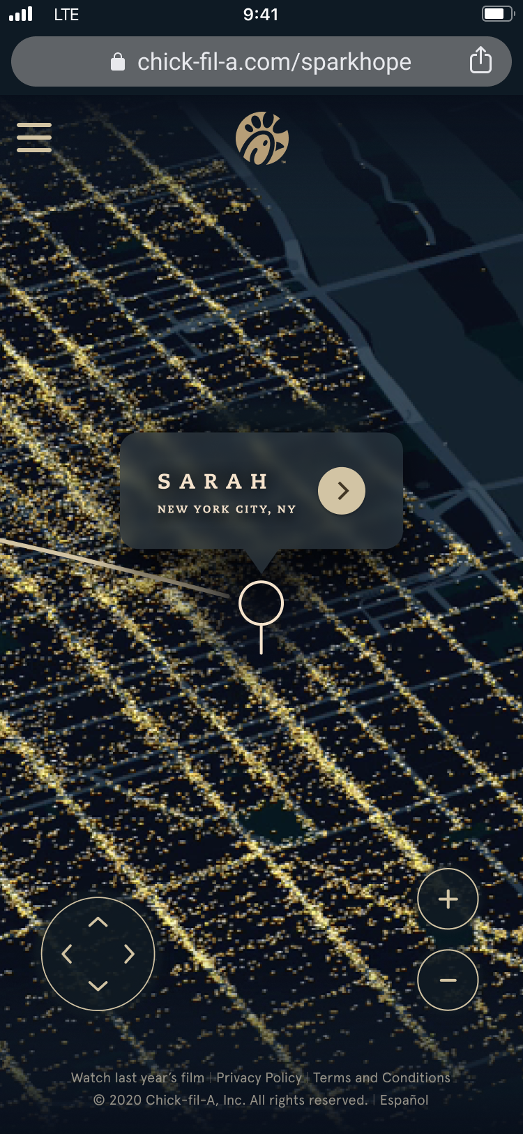
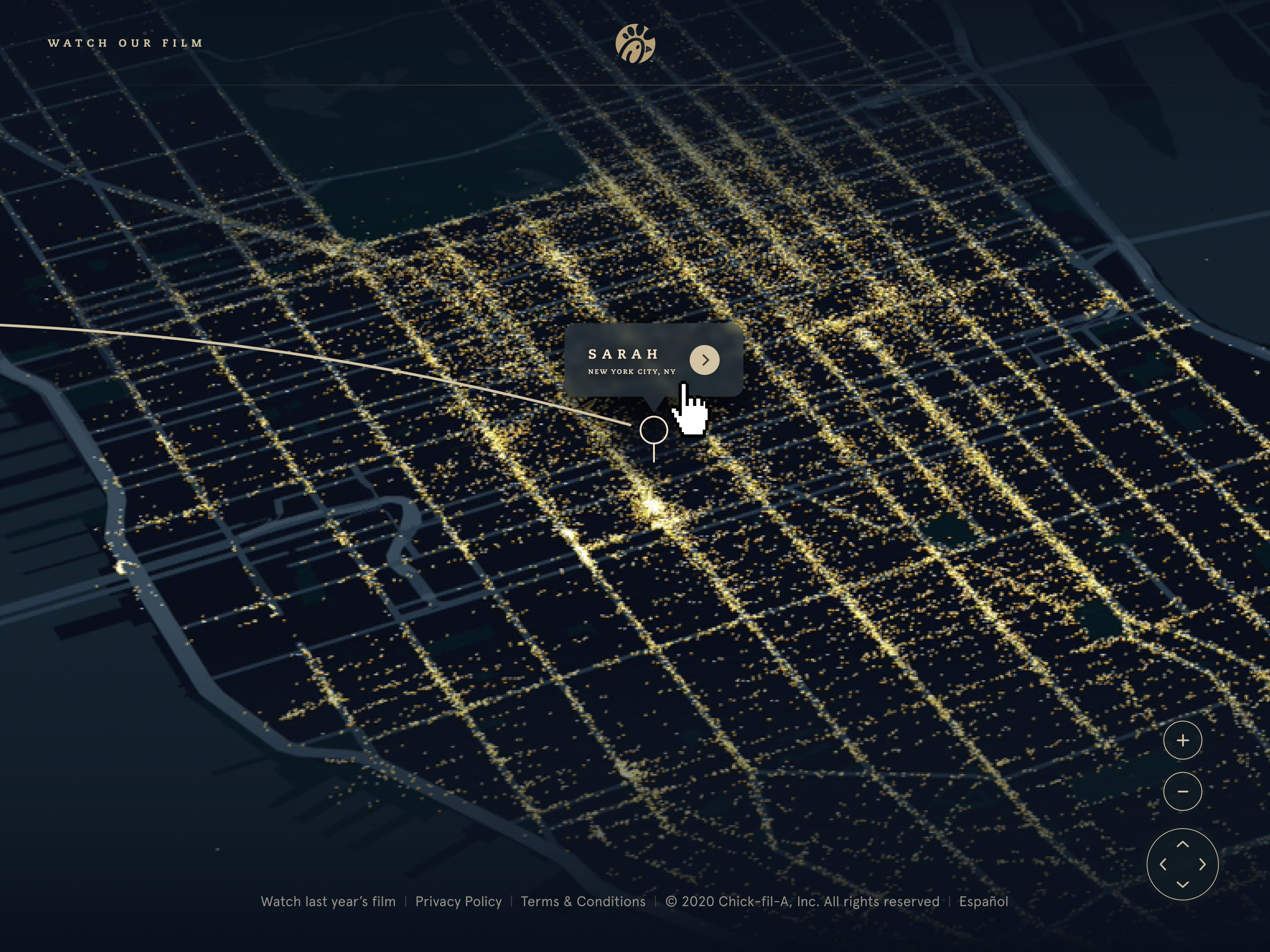
An interactive map microsite for Chick-fil-A's holiday 2020 campaign. The concept: an expressive, illustrated map experience that told a warm, place-rooted story at a moment when people were thinking a lot about home, distance, and belonging.
The first pandemic holiday season was a precise context. People couldn't travel to the places and people they loved. The Evergreen campaign leaned into that — not as sentiment, but as a genuine understanding of what the audience was feeling and what they needed from this moment. A map that felt like going somewhere, even when you couldn't.
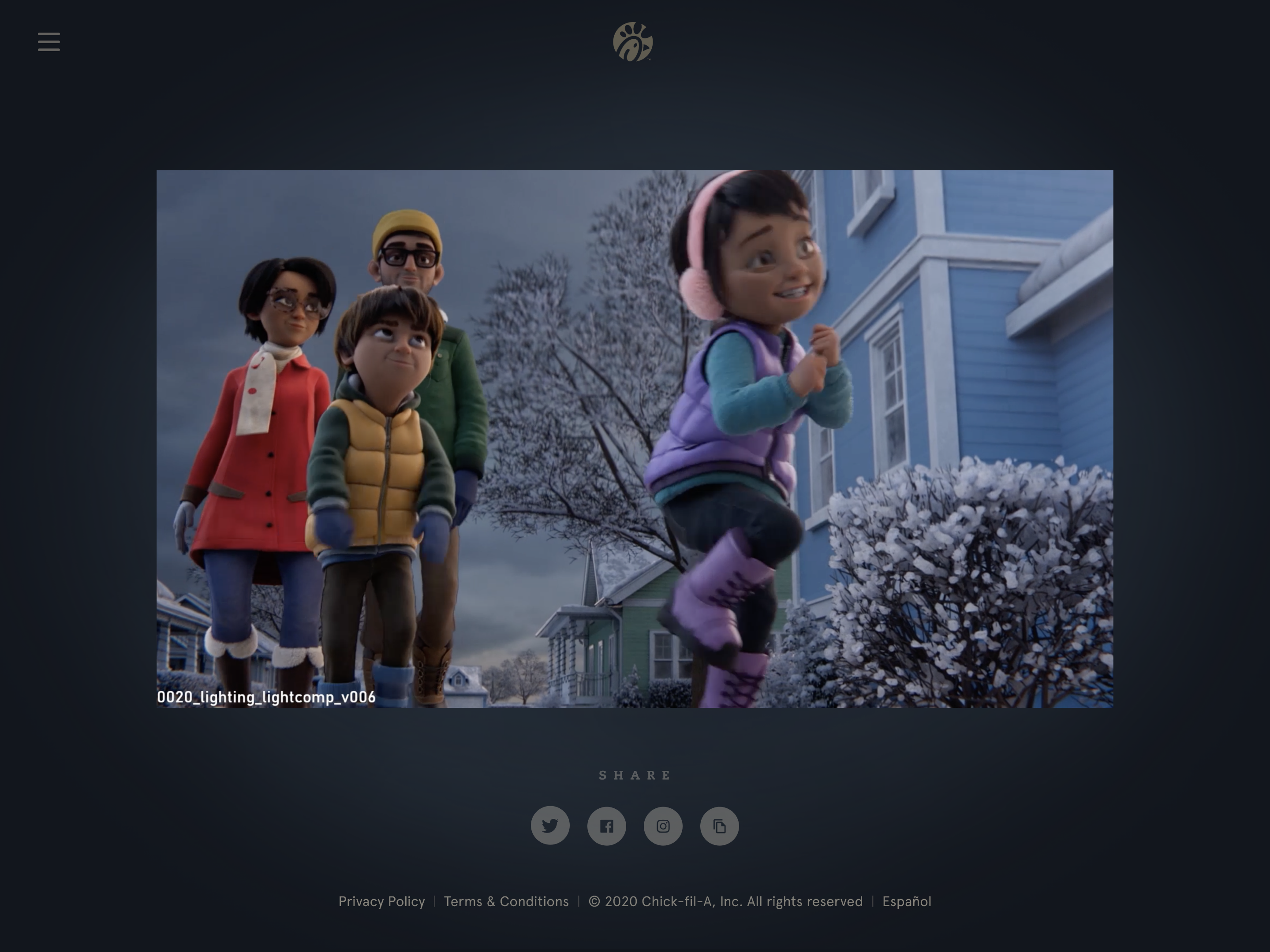
The work was a collaboration between two agencies. I handled UX and visual design at AKQA, working in close partnership with an animator based at a different studio throughout. Tight timeline. Cross-agency coordination. A project that had to feel handcrafted in a year when nothing else did.
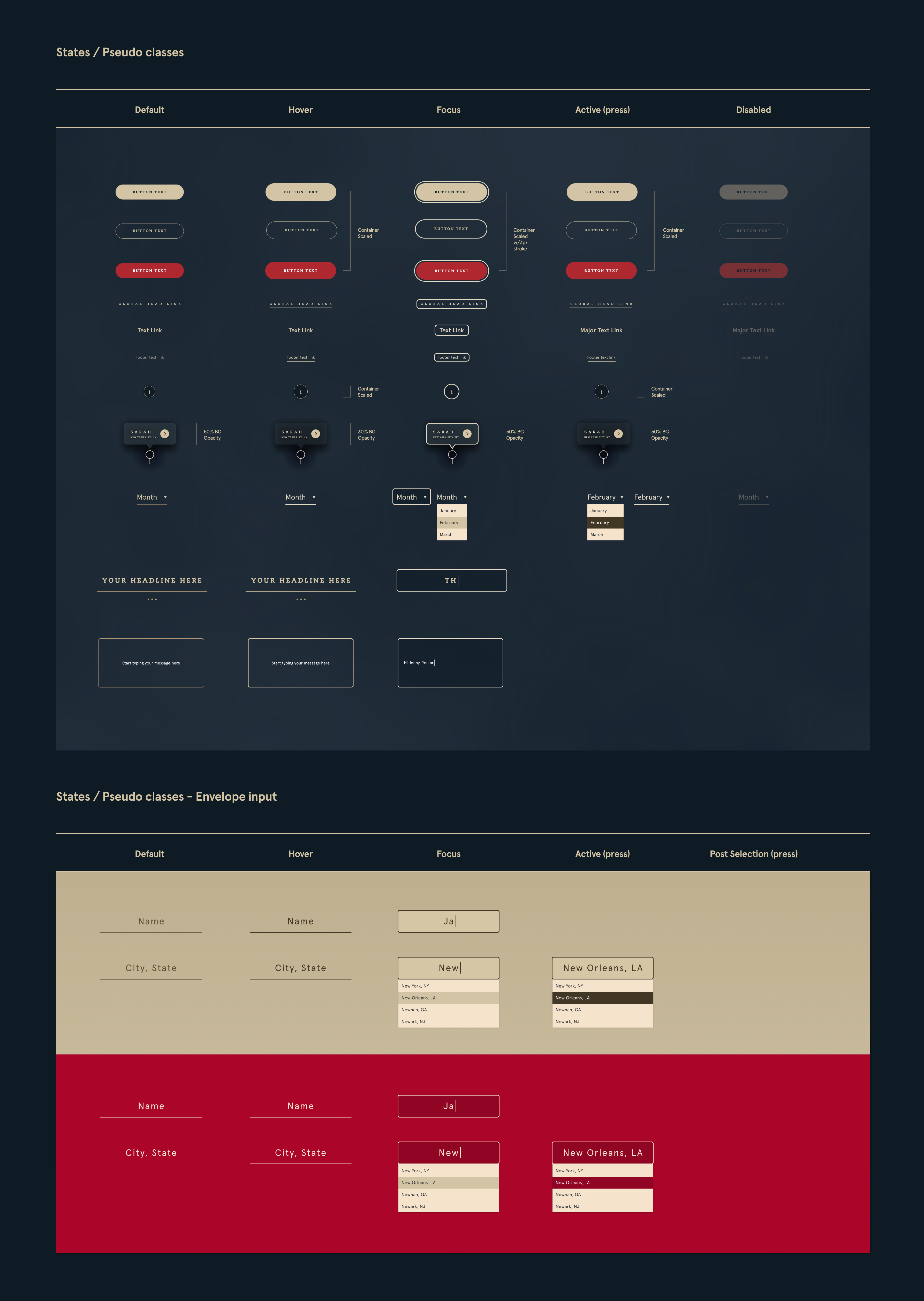
The design challenge was primarily expressive. The illustrated map style, the motion design, and the interaction model all had to cohere into something that felt genuinely crafted — not a product, not a campaign asset, but a small, beautiful thing.
The data visualization discipline here is at the opposite end of the register from Starchart's map module. Where Starchart's maps are minimal by design — one line, one region, maximum signal — Evergreen's map is maximal by intent. Warmth, texture, illustration, motion, place as feeling. Both are visualization problems. The difference is what the person on the other end needs to experience.
Interactive map microsite, film viewer, and component design — Figma wireframes and production frames from the Evergreen holiday campaign.
The Evergreen project is the outlier in this portfolio — the piece that doesn't fit neatly into the service design or systems thinking through-line. It's here because the best portfolios don't only show you what someone can execute on brief. They show you what someone finds beautiful.
Cross-agency coordination on a tight holiday timeline, shipping something expressive in a year that didn't feel very expressive — that required a particular kind of craft focus. You can't make a map feel warm by following a process. You have to actually care about the outcome.
The discipline question this project answers: can I shift registers? The answer is here. Service blueprint in the morning, illustrated holiday microsite by afternoon. Same care, different mode.